
Case Studies
Kanoma
Digital services company (ESN) specializing in tailor-made solutions for agile IT projects.
IT Services
B2B
Conception
Refonte
Website
design impacts
↗️ Sharp rise in applications
💼 3 recruitment within the first few months
⭐️ Better perception of Kanoma's personality by prospects and candidates
🎨 Site redesign and evolution of visual identity

Claire Hollebeque
Communication manager
It was a pleasure to work with Adeline on the redesign of the Kanoma website. She was able to identify our needs from the outset, provide us with recommendations and guide us in the creation of the various pages so that they reflected Kanoma's spirit, both in content and form, and also met our objectives.
Personally, I really enjoyed working with Adeline. She's educational, accommodating and responsive. She was able to guide me through all the stages of the redesign and the use of Framer.
Strengthened brand perception and streamlined user journeys, supporting talent attraction and client discovery.
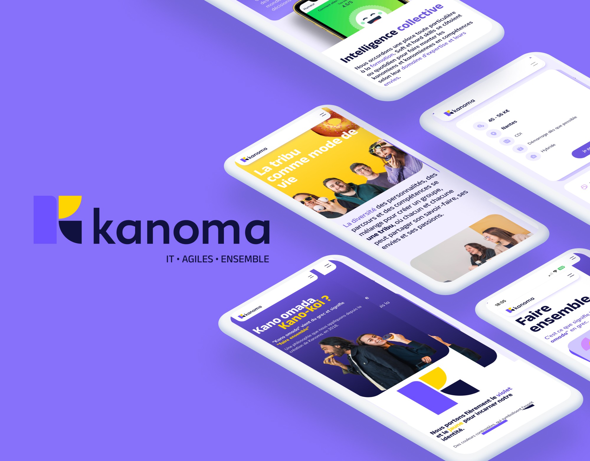
Kanoma's website no longer reflected their evolution. After modernizing their logo and graphic charter, they wanted to align their digital presence with this new identity.
The aim: to assert their image, clarify their mindset and their Kommunities, promote their expertise and attract new talent and customers.
As Product Designer at Lone Stone, I was chosen from among four competitors to redesign their site. My role was to improve their visibility, simplify the candidate pathway and capture leads through a more engaging experience. The challenge was also to guarantee internal teams autonomous management via Framer, an intuitive No-Code tool.
Discovery

After the kick-off with Kanoma. In total autonomy with the customer team, I began with an in-depth audit of the existing system to identify strengths and areas for improvement. A workshop was organized to prioritize Kanoma's needs, understand their expectations and refine objectives, while taking into account their HR constraints. The focus was on their identity and community spirit to attract talent and prospects, while aligning the artistic with the functional.
Strategy and UX

Once the objectives had been clarified, we defined an acquisition strategy and structured an optimized tree structure. I merged this tree structure with precise zoning to organize content efficiently, and created an UX Blueprint combining user flows, information architecture, and a site map to structure the experience before design. Collaboration was fluid thanks to asynchronous work with Claire, where she concentrated on text content and I on structure and user paths. Wireframes were avoided, as the upstream preparation was sufficiently detailed to allow us to move straight on to creating the UI mock-ups on Figma.
Identity & UI

For the visual aspect, a very clear UI kit guided the graphic design. Drawing on benchmarks, I refined the art direction to create a modern, engaging experience, true to Kanoma's identity. I then created mock-ups, taking into account Claire's feedback on texts and templates. I passed on the desired artistic direction to photographer Jessy Hihn, so that the shoot would reflect the site's universe and match the spirit of the mock-ups. Thanks to her talents and my recommendations, the portraits brought depth and authenticity to the whole.
No-Code integration

Once the mock-ups had been validated, I carried out the integration on Framer, totaling 15 pages, two CMS collections, adapted to three breakpoints for a fluid experience on desktop, tablet and mobile. Animations were added to energize the interface, making the experience more interactive and engaging. Technical adjustments were made in collaboration with Pierre, Tech lead at Kanoma, to ensure that the site was perfectly functional and optimized, with particular emphasis on Aria tags.
Delivery and Training

After delivery of the site, I spent half a day training three members of the Kanoma team in the use of Framer, as well as providing them with Notion documentation to enable them to manage the site independently. Valentin, PM at Lone stone, worked with Pierre and I on URL migration to ensure a smooth transition from the old to the new site, ensuring continuity of traffic and user experience.
Improving the user experience and highlighting their expertise have paid off: a significant increase in applications has been observed, leading to recruitment within the first few months. What's more, feedback shows that their mission and areas of expertise are now better understood. Integration on Framer and training of the teams guarantee their autonomy to develop the site with ease.
Kanoma

Have a project in mind?
Let’s talk